10 Must-Try Latest Colour Trends in Home Decor for a Stylish Makeover
Have you ever walked into a room and instantly felt energized, calm, or even slightly uncomfortable without knowing why? That’s the silent power of color at work in your home. we will discuss about 10 Must-Try Latest Colour Trends in Home Decor for a Stylish Makeover in this post.
Your walls aren’t just structural elements—they’re massive mood-influencing canvases. The latest colour trends in home decor aren’t just about looking Instagram-worthy; they’re about creating spaces that actually make you feel something.
I’ve gathered the 10 most influential color trends that designers are obsessing over right now. These aren’t just random pretty shades—they’re strategically chosen palettes that can transform your space from “meh” to “wow” with surprisingly little effort.
But before I reveal which unexpected color is making minimalists rethink their entire philosophy…
Understanding Today’s Color Psychology in Interior Design
How colors affect mood and perception
Ever walked into a room and instantly felt calm or energized without knowing why? That’s color psychology at work.
Colors aren’t just pretty additions to your home—they’re mood-altering elements that can transform how you feel in a space. Blue tones typically bring tranquility (perfect for bedrooms), while vibrant yellows wake up your brain (hello, kitchen motivation!).
But it goes deeper than simple emotions. Red can actually increase your heart rate and stimulate appetite—which explains why so many restaurants use red in their décor. Green connects us to nature and reduces eye strain, making it ideal for home offices where you spend hours staring at screens.
The trick is understanding what you want from each room. Need productivity in your workspace? Skip the calming pastels and opt for energizing hues instead.
The shift from neutrals to bold statements
The days of playing it safe with whites and beiges are fading fast. People are tired of cookie-cutter interiors that look like everyone else’s Instagram feed.
Bold color choices are making a serious comeback. We’re talking rich emeralds, dramatic navies, and even black accent walls that would’ve made designers clutch their pearls a few years ago.
Why the change? After spending so much time at home, many realized their safe neutral spaces felt… boring. Personality became priority number one.
This doesn’t mean throwing taste out the window. Today’s bold statements are intentional and thoughtful—a carefully chosen crimson wall behind a bed or a deep teal kitchen island that anchors the space.
Balancing trendy colors with timeless elements
Here’s the million-dollar question: how do you embrace exciting color trends without creating a space that’ll look dated faster than last season’s fashion fads?
The secret is balance. When incorporating trending colors like terracotta or sage green, pair them with elements that stand the test of time. Think classic architectural details, quality natural materials, and traditional furniture silhouettes.
Smart designers use the 80/20 rule: keep 80% of your space in timeless tones and materials, then have fun with the trending 20% through:
- Accent walls that can be repainted
- Statement furniture pieces that pop
- Accessories and textiles that can be swapped seasonally
This approach gives you the best of both worlds—an on-trend space that won’t require a complete overhaul when color preferences inevitably shift again.
Remember, your home should reflect who you are, not just what’s trending. The most successful interiors mix current colors with personal pieces that tell your unique story.
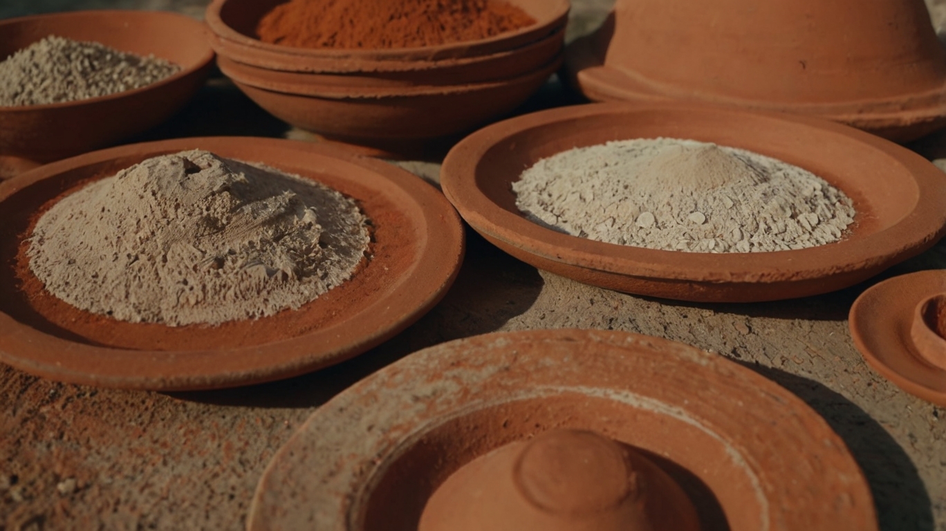
Earthy Tones: The New Neutrals
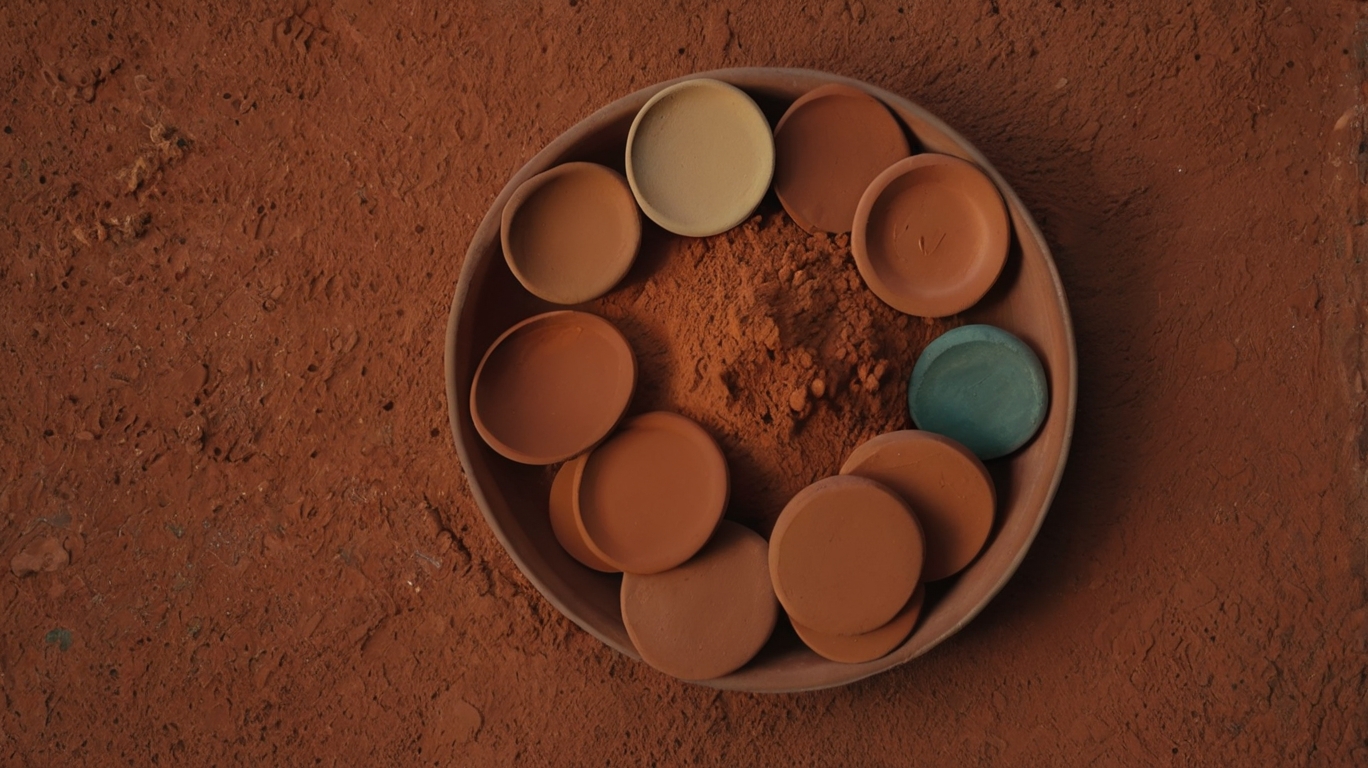
Gone are the days when beige and gray ruled the neutral landscape. Terracotta is stealing the show with its warm, rich character. This rusty orange-brown shade adds instant warmth to any space without overwhelming it.
Try painting an accent wall in a living room or bedroom—it creates a stunning backdrop for artwork and plants. For smaller commitments, scatter terracotta accessories throughout your space: think vases, planters, throw pillows, or ceramic pieces.
What makes terracotta so special? It pairs beautifully with everything from crisp whites to deep blues, making it incredibly versatile. And unlike trendy colors that quickly feel dated, this earthy hue has staying power.
Sage green: bringing the outdoors in
Sage green is having a serious moment. This muted, grayish-green tone brings tranquility to interiors while maintaining a contemporary edge.
The beauty of sage lies in its subtlety. It’s calm enough to work as a main color yet distinctive enough to make a statement. Try it in kitchens (sage cabinets are stunning), bathrooms, or bedrooms where its soothing qualities shine brightest.
The color works magic in spaces that need a refresh without a complete overhaul. A sage green sofa or set of curtains can transform a room while maintaining harmony with existing pieces.
Warm browns and caramels for cozy spaces
Brown is back—but not the heavy chocolate browns from decades past. Today’s browns are lighter, more nuanced caramels and toffees that add sophistication and warmth.
These warm browns create instant coziness in living rooms and bedrooms. They’re particularly effective in north-facing rooms that need warming up or spaces that feel too stark.
Caramel leather furniture has become a staple in stylish homes, aging beautifully over time. For less commitment, incorporate these tones through wooden furniture, textiles, or even a caramel-toned jute rug.
Styling tips for earthy color combinations-10 Must-Try Latest Colour Trends in Home Decor for a Stylish Makeover
The magic of these earthy tones is how well they play together. Create depth by combining multiple shades within the same family—lighter sage with deeper olive, or soft terracotta with richer rust.
Ground these colors with natural materials. Think wood, rattan, clay, and linen. The textures enhance the organic quality these colors bring.
For contrast that doesn’t clash, introduce small touches of black through light fixtures, picture frames or hardware. For a more dramatic look, pair earthy tones with deep blues or greens.
Remember the 60-30-10 rule: use your dominant earthy tone for 60% of the space, a secondary color for 30%, and an accent for the remaining 10%. This creates balance while maintaining visual interest.
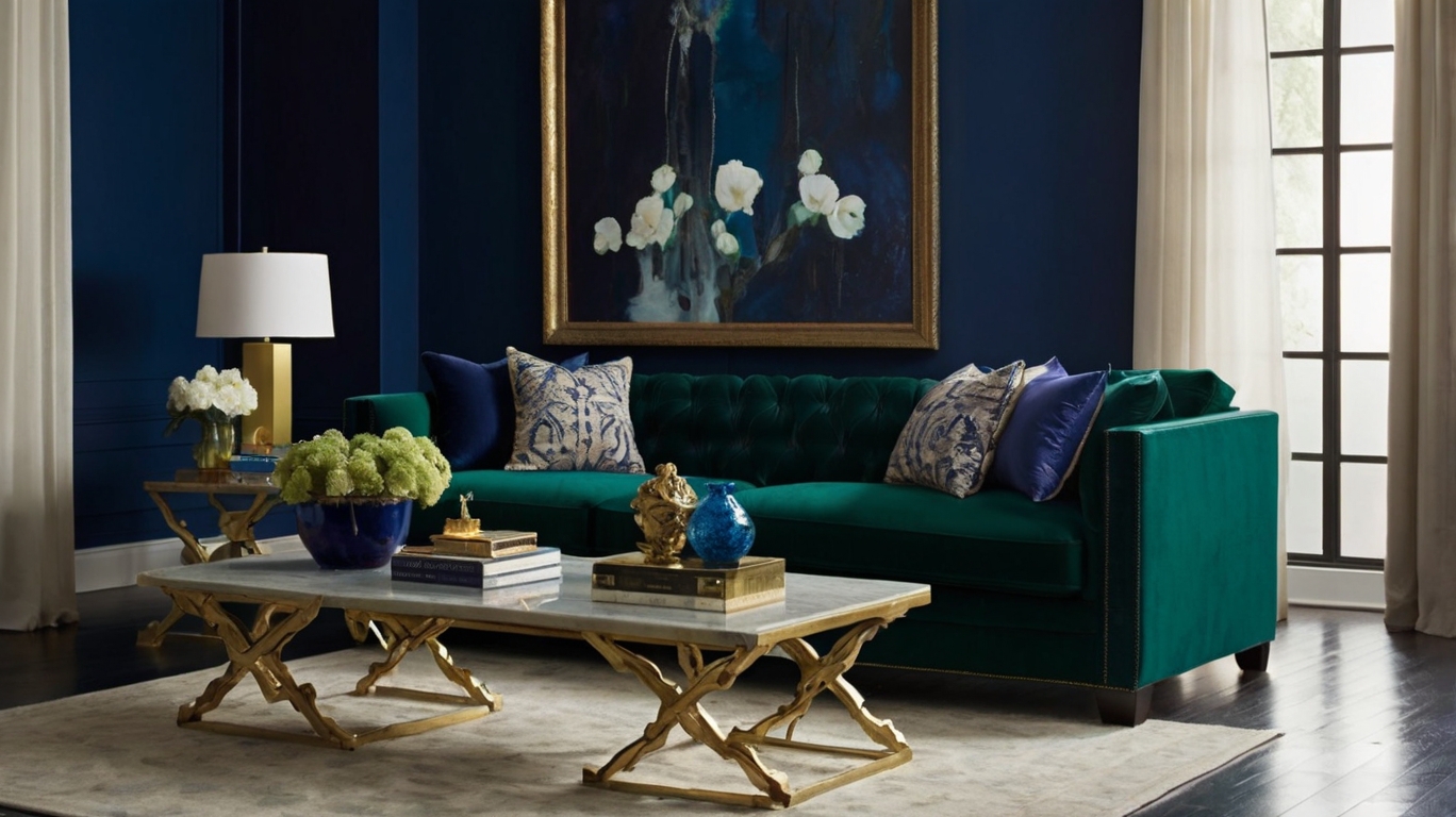
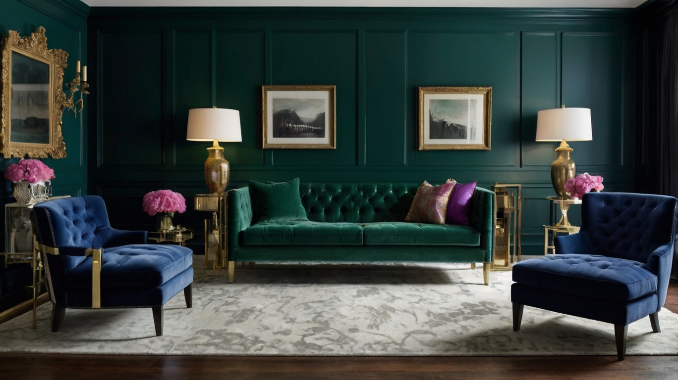
Jewel-Inspired Color Schemes
Emerald green for luxury and sophistication
Remember when everyone was doing all-white everything? Those days are gone. Emerald green has stormed into homes, bringing with it an undeniable sense of luxury that white just can’t match.
This rich, deep green isn’t just another color—it’s practically a status symbol now. I’ve seen it transform boring living rooms into spaces that look straight out of a design magazine. It works because it’s bold without being loud, elegant without trying too hard.
The trick is how you use it. An emerald velvet sofa becomes the star of any room. Or go dramatic with emerald walls that make your art collection pop like never before. Even small touches—think emerald throw pillows or a plush area rug—can elevate your space instantly.
Pair it with brass or gold accents and watch the magic happen. The combination feels expensive, even if you’re shopping on a budget.
Sapphire blue as a statement choice
Sapphire blue isn’t for the faint of heart—and that’s exactly its appeal. This intense, vibrant blue captures attention immediately and holds it.
When you’re tired of playing it safe, sapphire blue walls create instant drama. I’ve seen rooms completely transformed by this single choice. The color has depth—sometimes appearing royal blue, sometimes with purple undertones, changing subtly throughout the day.
It pairs beautifully with crisp whites for contrast or warm neutrals for balance. Want to really make a statement? Try sapphire blue kitchen cabinets. Your friends won’t stop talking about them.
The color works surprisingly well in many settings:
- Home offices (promotes focus and creativity)
- Dining rooms (creates an intimate atmosphere)
- Bathrooms (unexpected luxury)
Ruby and amethyst accents to elevate any room
The right accent pieces in ruby red or amethyst purple can transform a space from forgettable to unforgettable.
Ruby red brings warmth and energy. It demands attention without overwhelming when used strategically. Think ruby table lamps, artwork with red focal points, or even just a stack of books with red spines on your coffee table.
Amethyst purple introduces a touch of mystery and sophistication. It reads as both regal and creative simultaneously. An amethyst-colored throw blanket, decorative glass objects, or even purple-toned flowers make for perfect accent pieces.
The beauty of these jewel-toned accents is their versatility. They complement neutrals beautifully but also play well with other bold colors. And unlike painting an entire wall, these smaller investments let you experiment without commitment.
How to incorporate jewel tones without overwhelming spaces
The key to using jewel tones successfully? Restraint. Too much emerald, sapphire, ruby or amethyst can make your space feel like a medieval castle—and not in a good way.
Start with the 60-30-10 rule:
- 60% of your room in a neutral base
- 30% in a secondary color
- 10% in your jewel tone accent
This approach lets the jewel tones shine without shouting. White, cream, gray or taupe walls provide the perfect backdrop for jewel- colored furniture or accessories.
Consider these easy entry points:
- Throw pillows and blankets
- Statement art pieces
- Table lamps or pendants
- A single accent chair
- Curtains or rugs
Balance is everything. If you go bold with an emerald sofa, keep everything else understated. Dark jewel tones also need plenty of light—natural or artificial—to prevent rooms from feeling cave-like.
And remember: you can always start small. A few carefully chosen jewel-toned accessories might be all you need to give your space that rich, luxurious feel everyone’s after right now.
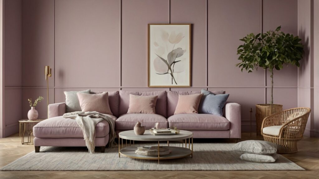
Pastel Revival with a Modern Twist
Contemporary takes on blush pink
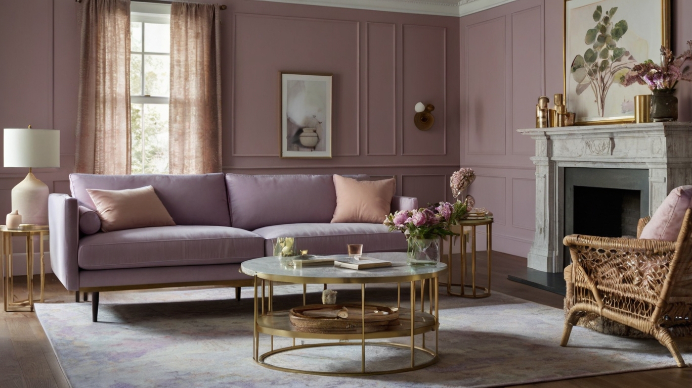
Blush pink isn’t just for nurseries anymore. This sophisticated hue has grown up and become a powerhouse neutral that works almost everywhere. Today’s blush has evolved beyond the saccharine sweet versions of the past.
Designers are pairing it with unexpected elements like matte black fixtures and concrete surfaces for a look that’s anything but precious. The magic happens when you layer different tones – try a dusty rose sofa against a deeper mauve accent wall for dimension that feels fresh and modern.
What makes contemporary blush work so well? It’s versatile enough to warm up minimalist spaces without overwhelming them. Plus, it plays nicely with natural materials like light wood and rattan, creating balance in your space.
Soft lavender as the unexpected neutral
Forget what you thought you knew about purple. Today’s lavender is the quiet rebel of the color world – subtle enough to function as a neutral but interesting enough to make a statement.
The trick is choosing the right shade – look for lavenders with gray undertones that feel sophisticated rather than childish. This color creates magic in spaces that need warmth without heaviness.

Designers are using soft lavender on kitchen cabinets, bedroom walls, and even bathroom vanities. It’s the perfect backdrop for brass fixtures and natural stone, creating a luxe vibe without trying too hard.
Mint and pale blue for serene environments
Want instant calm? Mint and pale blue are your go-to colors for creating spaces that feel like a deep breath.
These colors work wonders in high-stress areas like home offices and bedrooms. The key is choosing versions with gray undertones to keep things grown-up and versatile. Mint green has emerged as the surprise MVP in modern kitchens, replacing clinical white with something equally fresh but infinitely more interesting.
Pale blue, meanwhile, is making waves in living spaces when paired with natural textures like jute and linen. These colors reflect light beautifully, making smaller spaces feel more expansive and airy.
Bold Color Blocking Techniques
Creating visual interest with contrasting colors
Color blocking isn’t for the faint-hearted. It’s bold, it’s dramatic, and when done right, it’s absolutely stunning.
The secret? Contrast. Think navy blue walls with mustard furniture. Or emerald green cabinets against blush pink walls. The magic happens when colors from opposite sides of the color wheel meet.
Want to make a small space appear larger? Try painting your ceiling a completely different color from your walls. A white ceiling against deep burgundy walls creates height, while a black ceiling above white walls adds unexpected drama.
Don’t just stick to walls. A vibrant cobalt blue sofa against a crisp white wall creates that perfect focal point without committing to permanent changes.
Room-specific color blocking strategies
Your living room can handle more dramatic contrasts than your bedroom. Makes sense, right?
For living spaces, try the 60-30-10 rule. Use your primary color for 60% of the room (usually walls), a secondary color for 30% (large furniture), and an accent color for 10% (accessories).
In bedrooms, soften your approach. Instead of stark contrasts, try analogous colors (neighbors on the color wheel) with one bold accent. Think sage green walls, olive bedding, with ruby red throw pillows.
Kitchens? They’re perfect for two-tone cabinets. Navy lowers with white uppers create balance without overwhelming the space.
Furniture and architectural elements as color blocks
Architectural features are begging to be highlighted through color blocking.
That archway between your dining and living room? Paint it a completely different color. Your staircase risers? Turn them into a rainbow gradient.
Built-in bookshelves create instant color blocks when their back walls are painted in a contrasting hue. The items displayed then pop against the colorful backdrop.
Furniture becomes part of your color blocking strategy when you choose pieces in bold, contrasting colors. A sunshine yellow armchair against a deep purple wall? Chef’s kiss.
Tips for maintaining harmony with bold combinations
Color blocking can go wrong quickly. Really wrong. Here’s how to avoid disaster:
- Stick to the same color intensity throughout. All jewel tones or all pastels, not a mix.
- Use a neutral as one of your colors to give the eye somewhere to rest.
- Repeat colors throughout the space. That teal on your wall should appear again in smaller doses elsewhere.
- Test before committing. Paint samples on boards you can move around the room to see how light affects the contrasts.
- When in doubt, look to nature for color combinations that work harmoniously together.
Monochromatic Approaches That Wow
A. Varying shades of a single color for depth
Think monochromatic is boring? Think again. When done right, it’s straight-up design magic.
Working with different shades of one color creates depth that pulls you in. Start with your base color – maybe a soft sage green – then layer in lighter and darker versions. The lightest shade works perfectly for ceilings and trim, while mid-tones cover most walls. Save those deep, rich versions for accent walls or architectural features you want to highlight.
The secret? The 60-30-10 rule. Use your main shade for 60% of the space, a secondary tone for 30%, and the boldest version for that final punch at 10%. This creates natural visual flow without trying too hard.
B. Textural elements that enhance monochromatic designs
Texture is what saves monochromatic rooms from falling flat. Without it, you’re just living in a color swatch.
Mix in rough jute rugs against smooth painted walls. Add velvet pillows that catch light differently than linen curtains in the same color family. Incorporate woven baskets, hammered metal fixtures, and ceramic vases – all in your chosen hue.
The contrast between matte and glossy finishes? Total game-changer. Paint your walls in a flat finish, then add furniture or accessories in the same color with high-gloss. The way they reflect light differently creates subtle distinction that feels sophisticated, not matchy-matchy.
C. Breaking rules with unexpected monochrome combinations
Monochrome doesn’t mean picking straight from the same color strip at the paint store.
Try this instead: choose colors that aren’t traditionally considered in the same family but share undertones. A dusty mauve wall with burgundy accents and blush textiles creates an unexpectedly cohesive look because they all share those red undertones.
Or go bold with a tonal blue scheme that ranges from nearly-gray slate to vivid cobalt. The key is maintaining either warmth or coolness throughout all selections.
Don’t forget that black, white and metallics act as neutrals in monochromatic spaces. A primarily emerald room can absolutely incorporate a brass lamp or white ceiling without breaking the monochrome vibe.
Biophilic Color Trends
Nature-inspired greens and blues
Bringing the outdoors in isn’t just a design philosophy—it’s becoming a mental health necessity. Green tones like sage, moss, and emerald are dominating walls in homes where people crave that connection to nature.
The psychology is simple: these colors make us breathe easier. A deep forest green accent wall in your living room isn’t just pretty—it actually lowers your heart rate after a stressful day.
Blues are making a similar splash, especially those reminiscent of water bodies. Think rippling lake blue or deep ocean teal. These shades work wonders in bedrooms and bathrooms, creating spaces that feel like personal retreats rather than just functional rooms.
Sunset-inspired oranges and yellows
The warm side of the biophilic spectrum is having a moment. Terracotta, amber, and marigold are bringing the magic of sunset hours into homes everywhere.
These colors aren’t just decorative—they’re transformative. A golden yellow kitchen feels perpetually sunlit, even on rainy days. That burnt orange dining room? It makes every meal feel like a special occasion bathed in perfect golden-hour lighting.
The trick is using these colors intentionally. They’re powerful, so a little goes a long way. Think accent walls, statement furniture, or textiles that capture that magical sunset glow.
Grounding earth tones for wellness-focused spaces
Clay, sienna, chocolate, and stone—these earth tones are the foundation of any biophilic color scheme. They work because they mirror the ground beneath our feet, creating spaces that feel stable and secure.
In a world that feels increasingly chaotic, these colors offer visual reassurance. A rich chocolate brown leather sofa anchors a living room. Stone-colored walls in a home office create a cave-like focus den that helps you tune out distractions.
These colors pair beautifully with natural materials—think raw wood, unpolished stone, and natural fibers that enhance their grounding quality.
Plant pairings that enhance color schemes
The ultimate biophilic move? Pairing your color choices with actual living plants. This isn’t just about aesthetics—it’s about creating a complete sensory experience.
Dramatic dark greens call for bold, structural plants like fiddle leaf figs or monstera. Earthy tones work beautifully with textural plants like snake plants or ZZ plants. For sunset hues, try plants with colorful foliage like calatheas or crotons.
Place plants strategically to draw the eye to colored features in your space. A trailing pothos cascading from a shelf draws attention to that carefully chosen wall color behind it. A statement palm creates a visual conversation with your earth-toned furniture grouping.
Dark and Dramatic Color Directions
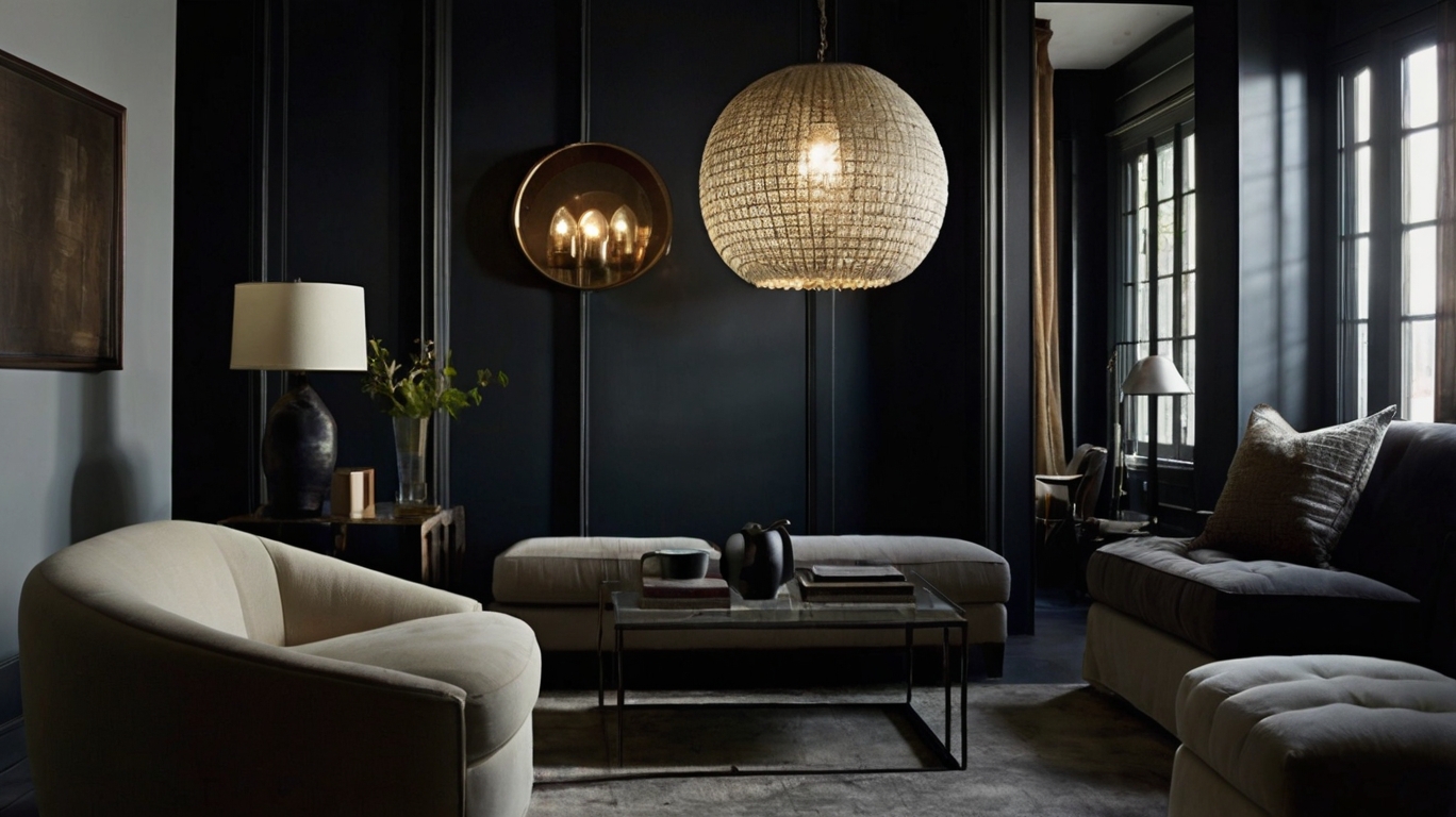
Charcoal and Navy as New Foundation Colors
Gone are the days when white and beige dominated our walls. The design world has flipped the script, and now those moody, sophisticated darks are taking center stage. Charcoal and navy aren’t just accent colors anymore—they’re the new neutrals.
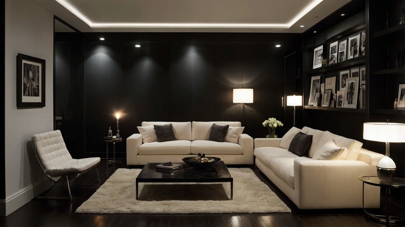
Charcoal walls create this incredible depth that makes your decor pop like nothing else. Your white picture frames, gold accents, and light furniture suddenly look intentional, not just thrown together. It’s like magic how these dark backdrops make everything else in the room feel more luxurious.
Navy is having its moment too. It’s that perfect balance of bold yet timeless. A navy living room or bedroom feels both current and classic—something you won’t tire of after six months. Try Benjamin Moore’s “Hale Navy” or Farrow & Ball’s “Stiffkey Blue” for that perfect inky blue that changes subtly throughout the day.
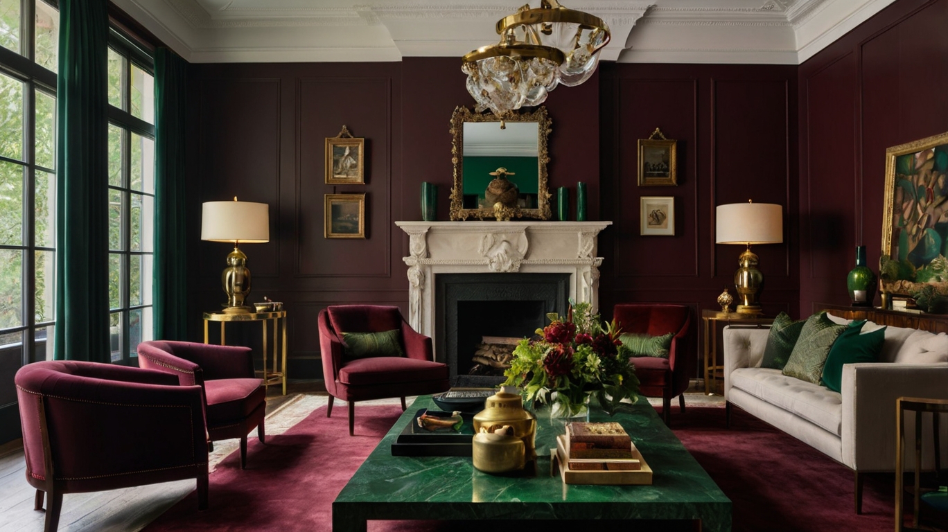
Deep Burgundy and Forest Green for Timeless Elegance
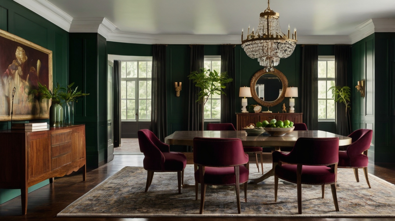
These rich, saturated hues are the design equivalent of a fine wine—they just get better with age. Forest green brings the outdoors in without feeling like you’re living in a jungle. It pairs beautifully with brass fixtures, natural wood, and cream textiles.
Burgundy—that delicious wine-inspired color—adds instant warmth and sophistication. It works wonders in dining rooms where it creates this intimate, conversation-friendly atmosphere. The trick is finding that perfect shade that leans more sophisticated than Christmas-y.
What makes these colors truly timeless is their versatility. They complement both modern and traditional furnishings, looking equally at home with sleek mid-century pieces or ornate antiques.
How to Balance Dark Colors in Smaller Spaces
Think small spaces can’t handle dark colors? Think again. The secret is all about balance and smart application.
Try the “accent wall” approach first if you’re nervous. Paint just one wall in your chosen dark shade and keep the others lighter. This creates depth without overwhelming the space.
Mirrors are your best friend in dark-colored small rooms. Position them strategically to bounce light around and make the space feel larger than it is.
Don’t forget your lighting game. Multiple light sources at different heights create layers of illumination that prevent dark colors from feeling cave-like. Think floor lamps, table lamps, and even candles for that perfect ambient glow.
The ceiling trick works wonders too—keep it white or very light to create height, even as your walls go dark and dramatic.
Color Trends for Different Home Areas-10 Must-Try Latest Colour Trends in Home Decor for a Stylish Makeover
A. Kitchen color innovations beyond white
White kitchens had their moment, but now it’s time to spice things up. Bold blues are making a splash in kitchen cabinetry, bringing depth and character that white simply can’t match. Imagine navy lower cabinets paired with lighter uppers—instant designer appeal without the designer price tag.
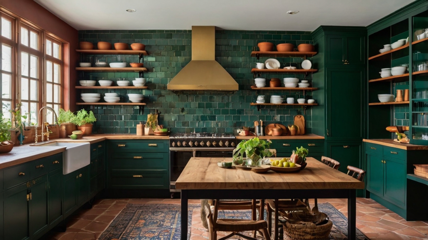
Green is another game-changer. From sage to emerald, green kitchens feel fresh and natural. They work beautifully with wood accents and brass hardware for that perfect balance of earthy and luxe.
Don’t overlook dramatic black kitchens, which are surprisingly practical (they hide cooking splatters better than white ever could) and undeniably sophisticated. For the color-shy, try black open shelving or a statement island instead of going all-in.
Terracotta and warm clay tones are making a comeback too. These sunset hues bring Mediterranean warmth to any kitchen, especially when paired with handmade tiles or natural stone countertops.
B. Bedroom palettes for better sleep and relaxation-10 Must-Try Latest Colour Trends in Home Decor for a Stylish Makeover
Your bedroom colors can make or break your sleep quality. Deep blues and soft greens tell your brain it’s time to wind down. These colors actually lower blood pressure and heart rate—nature’s own sleep aid.
Dusty pinks and mauves are having their moment too. They’re not just pretty; these hues create a cocooning effect that makes your bedroom feel like a safe haven from the world.
Skip stark whites which can feel clinical. Instead, go for creamy off-whites or soft taupes that feel warm and nurturing without being too dark.
For the brave, try a dark bedroom. Charcoal walls with crisp white bedding creates drama while still feeling restful. The contrast makes climbing into bed feel like an escape.
C. Living room colors that encourage gathering
Living rooms should draw people in and make them want to stay. Warm neutrals like caramel, ochre, and terracotta create an instant welcome. These earthy tones make spaces feel lived-in and comfortable from day one.
The new neutrals aren’t just beige. Think olive green, rust, and burnt orange—colors with personality that still play well with others. They’re perfect backdrops for your art and accessories.
Color blocking is making waves too. Try painting your ceiling or a single wall in a contrasting hue. It’s a low-commitment way to make a big impact.
Don’t forget that color isn’t just about paint. Incorporate your palette through textiles, art, and accessories. A neutral room with jewel-toned pillows and a rich rug creates depth without overwhelming your space.
D. Home office hues that boost productivity-10 Must-Try Latest Colour Trends in Home Decor for a Stylish Makeover
Your home office color can make or break your workday. Ditch sterile whites and grays—they don’t do you any favors in the productivity department.
Green is the productivity powerhouse. It reduces eye strain (crucial for screen time) and mimics nature, which has been proven to improve focus and efficiency. Even a soft sage on one wall can make a difference.
Blue promotes clear thinking and calm concentration—perfect for jobs requiring deep focus. Navy or royal blue accent walls create authority in zoom backgrounds too.
For creative roles, try pops of energizing yellow or orange. These stimulate innovation but can be overwhelming in large doses, so use them as accents through artwork or desk accessories.
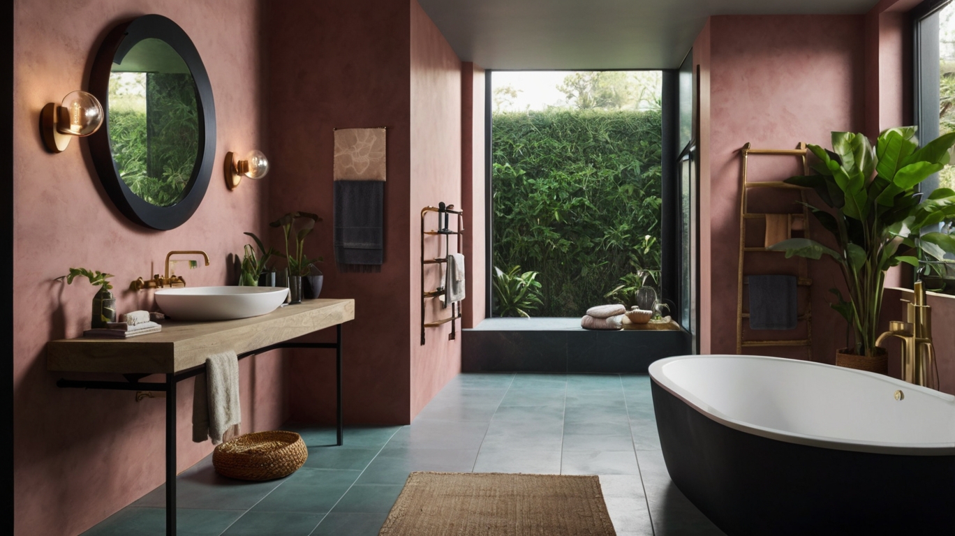
E. Bathroom color trends balancing spa-like calm with personality
Bathroom colors are moving beyond clinical white. Soft blues and greens create that coveted spa feeling while actually being more practical than white (they show less water spots and dust).
Black bathrooms are surprisingly luxurious. Matte black tiles with brushed gold fixtures feel like a boutique hotel experience. If going all-black seems too much, try black fixtures against lighter walls.
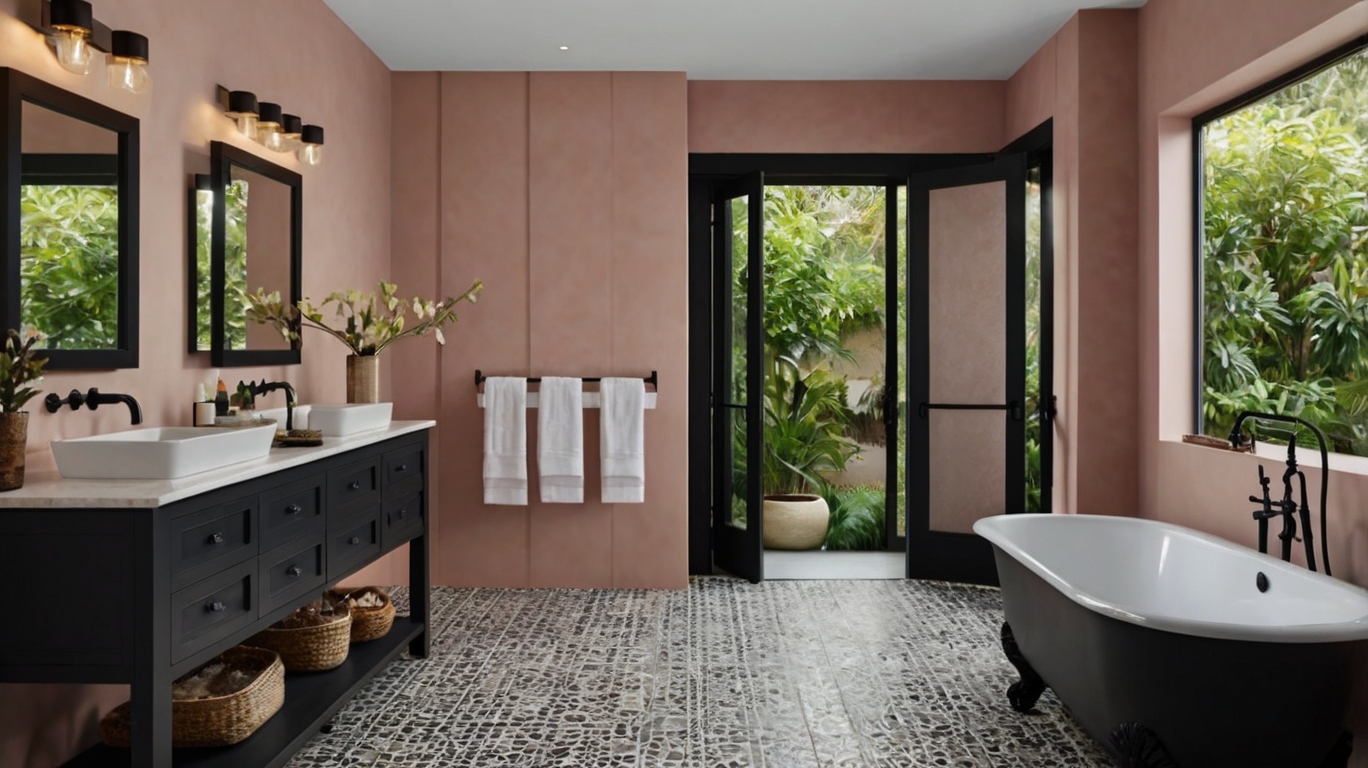
Earthy terracottas and clay pinks add warmth to typically cold bathroom spaces. They’re especially gorgeous in natural light and pair beautifully with plants, which thrive in bathroom humidity.
For small bathrooms, try jewel tones like emerald or sapphire. While conventional wisdom says light colors make spaces feel bigger, rich colors can create depth that makes small spaces feel intentional rather than cramped.
Implementing Trendy Colors on a Budget
A. Small-scale color updates with maximum impact
Want to refresh your space without breaking the bank? Color is your secret weapon. Swap out throw pillows in this season’s trendy shades – earthy terracottas or soothing sage greens make instant impact. Or grab some stylish planters in jewel tones to add pops of color while bringing nature indoors.
Picture frames are another easy fix. Paint mismatched frames in a bold color for a cohesive gallery wall that screams “I know what I’m doing.” And don’t overlook textiles – a new table runner, curtains, or even just switching out your hand towels can transform a room for under $50.
B. DIY projects to incorporate trending colors
You don’t need professional skills to nail the latest color trends. Grab some paint samples and create your own abstract art piece in complementary trendy shades. That blank wall has been begging for attention anyway.
Try color-dipping wooden utensils or furniture legs – just tape off the section you want colored and dip away. Or breathe new life into old furniture with chalk paint in a dramatic color. That dated side table? Now it’s your statement piece.
Feeling creative? Make ombré curtains by dip-dying plain white ones, or create color-blocked plant pots with painters tape and spray paint. Your friends will think you’ve been hiding secret design talents.
C. Temporary solutions for color-curious homeowners-10 Must-Try Latest Colour Trends in Home Decor for a Stylish Makeover
Commitment issues with color? No problem. Peel-and-stick wallpaper comes in every trendy shade and pattern imaginable and removes without damaging walls. Perfect for renters or the chronically indecisive.
Removable tile stickers can transform a kitchen or bathroom overnight. And don’t forget about washi tape – create geometric patterns on walls, furniture, or even appliances that peel right off when you’re ready for something new.
Fabric panels hung with Command strips add color without painting, and colorful lampshades can be swapped out seasonally. The point is: you can experiment with bold colors without making permanent changes to your space.
D. Investment pieces worth splurging on
Some color investments are worth every penny. A quality area rug in a timeless but on-trend color anchors your space and can last decades. The same goes for well-made curtains – they transform a room instantly and can move with you from home to home.
Statement lighting in a trendy finish (think brass or matte black) elevates your entire space. And if you’re going to splurge on furniture, choose versatile pieces with clean lines in colors that won’t quickly date.
Art is another splurge-worthy category. An original painting featuring trending colors creates instant impact and becomes more valuable over time. Plus, nothing says “grown-up home” like real art on your walls instead of that poster from college.
Conclusion
Embracing the latest color trends can completely transform your living space without the need for extensive renovations. From calming earthy tones that create a grounded atmosphere to dramatic dark hues that add sophistication, there’s a color direction to suit every personality and home style. The revival of pastels, the boldness of jewel tones, and the creativity of color blocking all offer exciting possibilities for expressing your personal style through color.
As discussed in this post, 10 Must-Try Latest Colour Trends in Home Decor for a Stylish Makeover, remember that implementing trendy colors doesn’t have to break the bank. Whether you choose to follow biophilic trends that connect your home to nature or experiment with monochromatic schemes for a cohesive look, small changes like new accent pieces or a feature wall can make a significant impact. Choose colors that not only reflect current trends but also resonate with your personal taste to create a home that feels both stylish and authentically yours.
